Mobile App Redesign in Saudi Arabia & UAE: From “Looks Amazing” to Actually Making Money (Real Case Studies)
In recent years, one of the most common things we hear is:
“We built an app that looks stunning… but the orders / sign-ups / revenue are nowhere near what we expected.”
The problem is rarely the business idea or the product itself.
Most of the time, the real gap lies between:
- A design that impresses the founder, investors, and marketing team
- A design that actually convinces real users to complete the next step instead of closing the app
In Saudi Arabia and the UAE especially, the market is extremely competitive and users have endless options.
If your app doesn’t win them over in the first 15:45 seconds, they are very likely already scrolling to find a competitor in the App Store or Play Store.
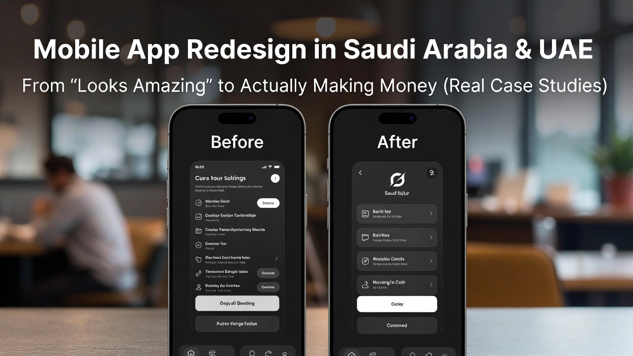
Case Study 1 – Food Delivery App in Riyadh: Completion Rate Jumped from 27% to 68%
A client had a food delivery application in Riyadh.
The home screen was packed: rotating banners, multiple categories, sponsored tiles, flashy promotions… it genuinely looked impressive when presented on a laptop or in pitch decks.
Reality check:
- Average time spent on home screen = 14 seconds
- Order completion rate = only 27%
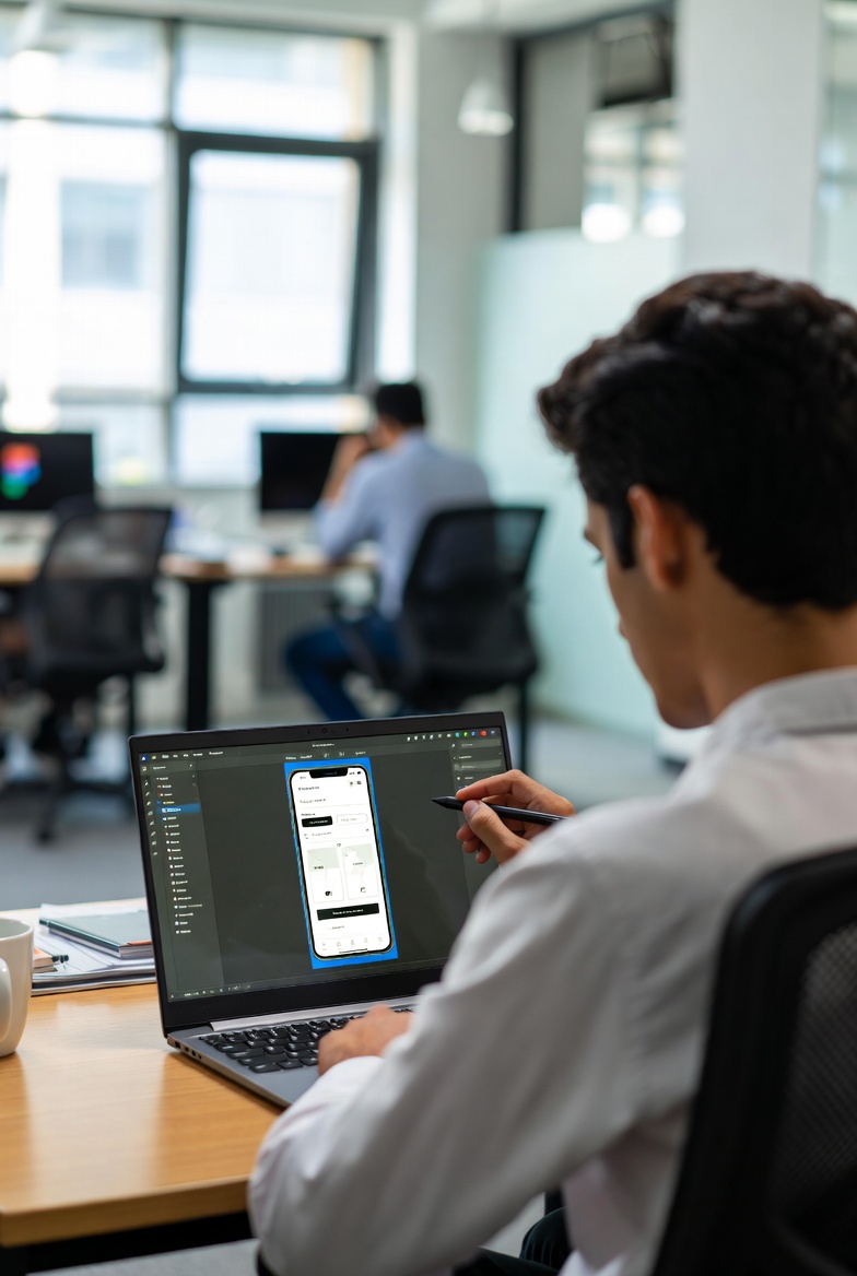
After a full app UI UX redesign, we made the following changes:
- Reduced main elements on the home screen to just 4 clear sections
- Created a large, prominent search bar at the top (62% of Saudi users search directly for restaurant names)
- Moved “Cart” and “Track Order” buttons into the natural thumb zone
- Added clear visual loading states (skeletons + subtle micro-interactions)
Results after only 6 weeks:
- Average session duration increased to 2 min 14 sec
- Order completion rate reached 68%
- Average Order Value (AOV) grew by 22%
Case Study 2 Home Services App in Dubai: Bounce Rate Dropped from 74% to 31%
An on-demand home cleaning and maintenance app.
The old version had:
- 9 primary buttons on the home screen
- Autoplay videos everywhere
- Very strong and conflicting colors
Biggest issue: users didn’t know where to start. The screen felt overwhelming → most bounced immediately.
After the app redesign service:
- Built a very clear linear 4-step booking flow
- Used a calm color palette with one strong accent color for CTAs
- Added a “Quick Book” shortcut for the single most requested service right on the home screen
- Organized services by urgency (Now ،Today ، Tomorrow)
Results within 3 months:
- Bounce rate fell from 74% to 31%
- Monthly bookings increased 2.8×
- Repeat customer rate rose from 11% to 39%
What Actually Makes a Difference When Redesigning Apps in the Gulf Market
1. Deep understanding of Gulf user behavior (not generic “global” patterns)
- Many users hold the phone in one hand while driving
- Cash on delivery is still heavily preferred → this option must be extremely visible and frictionless
- Trust is critical → the interface must feel safe and professional from the very first screen
2. Focus on Jobs-to-be-Done instead of visual polish alone
Instead of asking: “How do we make it look amazing?”
We ask: “What is the exact job the user is trying to complete right now?”
Very common jobs in Saudi Arabia & UAE:
- I want to order quickly before I get home
- I want to see the final price with no surprises
- I want to know exactly where my order is right now
3. Real user testing (not testing with friends or colleagues)
In more than 70% of the projects we analyze, post-launch data reveals:
- What the team thought was a “minor issue” was actually the main reason for drop-off
- What felt “very obvious” to insiders was confusing to first-time users
When Does Your App Really Need a Serious Redesign
We usually recommend a proper app UI UX redesign (not just a color refresh) when you see one or more of these signals:
- Bounce rate > 60:65% in the first 1:2 screens
- Primary task completion rate < 35:40%
- App Store reviews repeatedly mention “hard to use”, “confusing”, “not clear”
- 7-day retention below 20:25%
- Competitors are consistently gaining market share despite similar offerings
If several of these points sound familiar, it’s very likely that even if your current design “looks amazing” it is no longer serving your business goals.
Want to talk about your own app
If you tell me what type of application you have and what the biggest user friction / drop-off point is right now, I can suggest the first 3 changes most likely to deliver measurable improvement in the shortest time.